
Tropical Pond Painting - Up Close

I wanted to paint a tranquil place—a place where water swirled but didn’t rush, where plants were juicy and the light was inspiring. My canvas was tall and narrow, or short and wide, depending on which way I turned it. I could’ve gone panoramic, but wanted to try showing depth in a narrow frame. So I turned it vertically and stared into it. It’s funny how your mind can see something three dimensional on a flat surface if you let it. The fun part as an artist, is trying to make it appear.

What I saw in my mind’s eye, was a tropical paradise — natural, but also contrived. I’m a sucker for symmetry, so if I can style a plant to my will, I certainly will. The pond I imagined was close, almost as if I was standing in it, so the boundaries needed to go off the edges of the canvas. I wiggled a small stream behind it and decided ‘suggestion’ would be the key for this painting. Suggest the water goes far in the distance by narrowing and fading the lines. Suggest the sun is behind the trees with touches of yellow in the green. By suggesting more than what we see, the painting occupies more space. The depth is perceived in our imagination.

I started with light washes of color and let it dry. Then, with thicker paint, I added darker greens where I thought the large plants should be, and darker blues to the edges of the water. I tried to hint at mass rather than define every shape, and was probably squinty-eyed at the time. I’ve learned that squinting really helps with getting values right.
So now the painting had mid-tones and shadows, but it needed highlights. Since the surface of the land was mostly cool and dark, adding warm and bright tones on top would pop! I figured tall grasses would be great catchers of light, so I mixed a limey yellow and got to work. I used a fabulous little filbert wisp and small fan brush. It required a light touch and a lot of restraint, but the feathery strokes added fullness and texture. I love the surprises that come from special shaped brushes. It’s like putting paint through a Play-Doh machine and watching something fancy come out.

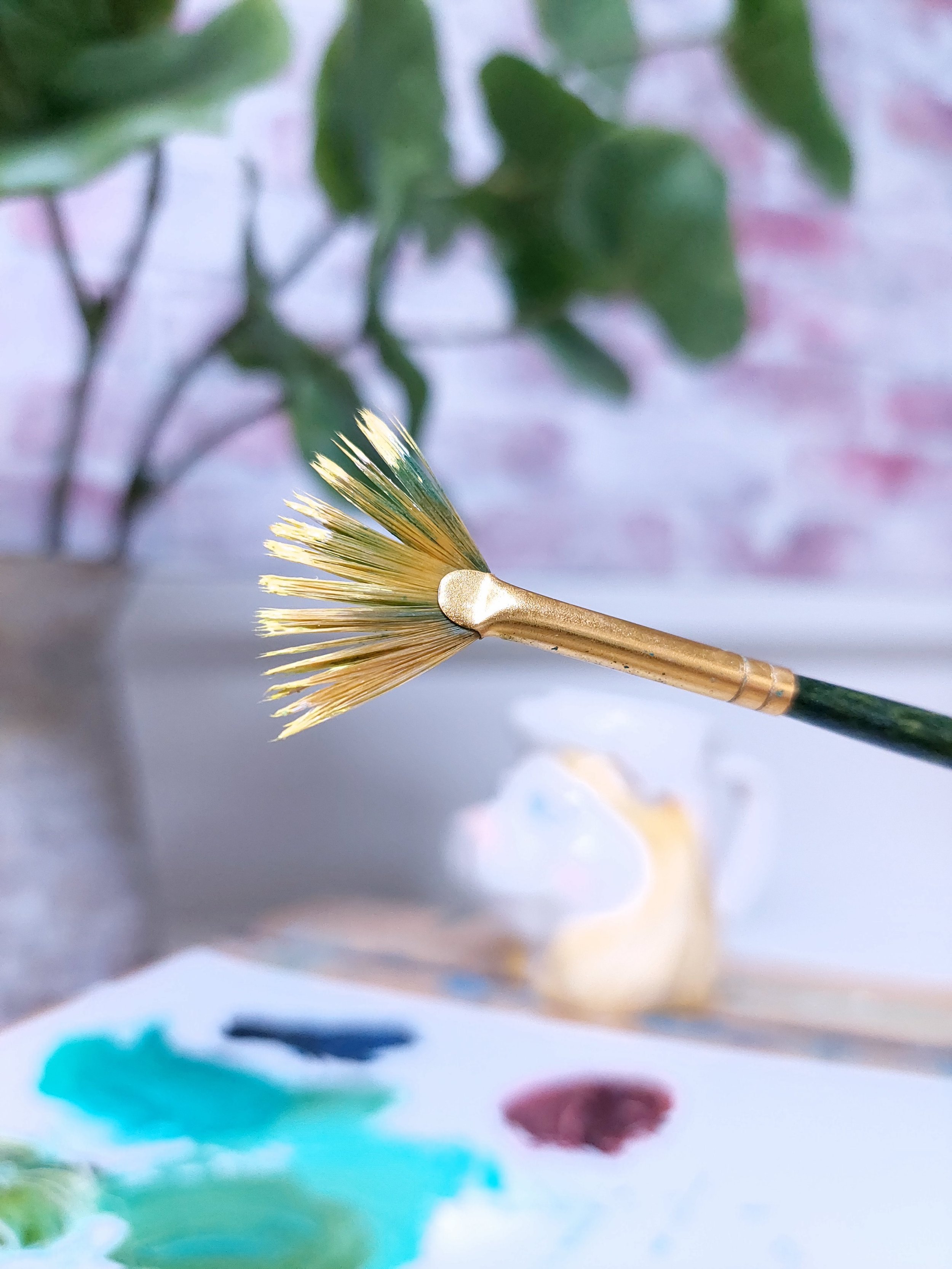
You’ll notice the bristles on this fan have separated a bit. That’s because (full disclosure) I don’t always clean my brushes perfectly. I hear you wincing, but no worries, a little neglect can sometimes make a tool more grass-worthy or sunlight-savvy. Please clean your brushes the very best you can, but if a late night leaves you lazy, don’t throw any gems away!

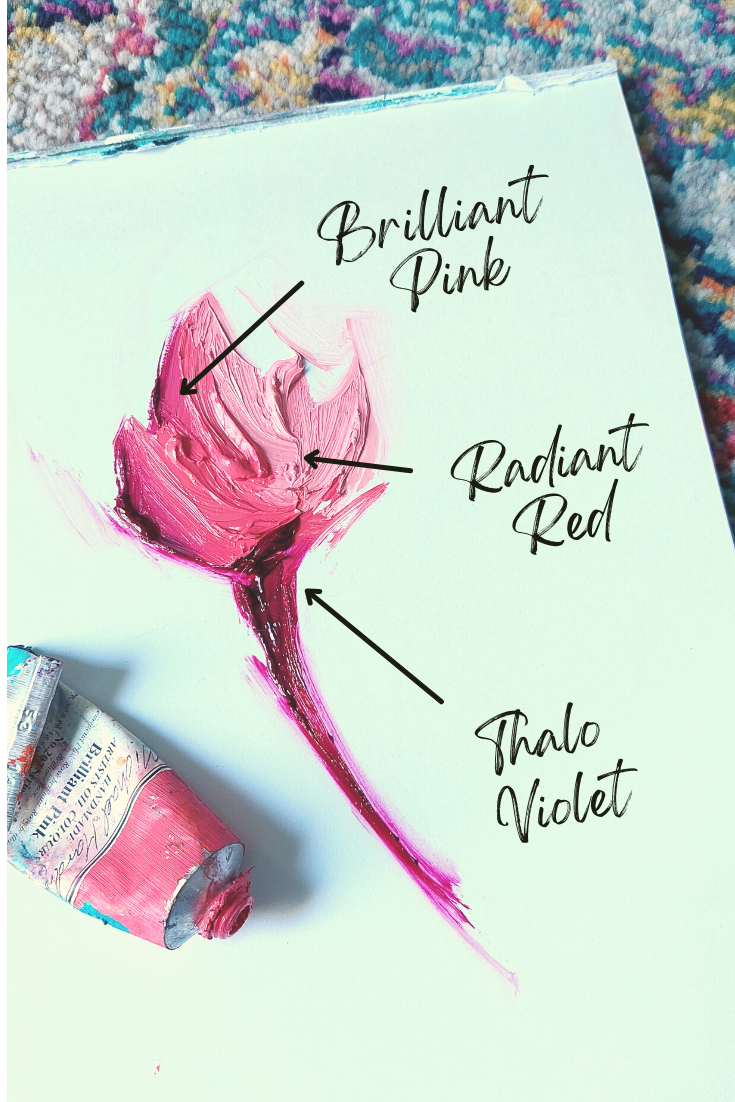
Okay, so be honest, do these water lilies look Dr. Seuss-ish to you? When I dabbed on the first petals I thought I saw a hint of Horton Hears a Who. You know, that flower-dust-thingy that all the ‘Whos’ live on. In seeing this, I was scared to add more paint. I didn’t want to lose the personality — or worse — harm any Whos! And since I was well on my way to making a very serious painting, I needed to protect any whimsy I could find. These are Thalo Violet on the underside, Brilliant Pink in the center, and Radiant Red (which is actually a light pink) on the tips. When I got my courage up, I added touches of white and orange for highlights, but I think the original three colors did a great job of creating dimension on their own.
These colors were bold, so I felt they needed to be repeated somewhere else in the painting for balance. I wasn’t wanting any more flowers though, so I had to ponder this one. Add pink to the branches? Like a reflection from the lilies below? My hand hovered with the brush for quite some time. Could they really cast a glow that far? No, not likely. But would it be cool if it did? Yes! So I went with it. It made the scene more moody and cozy I think. It looked like flickering light from a campfire, only in this case, the campfire was flowers.

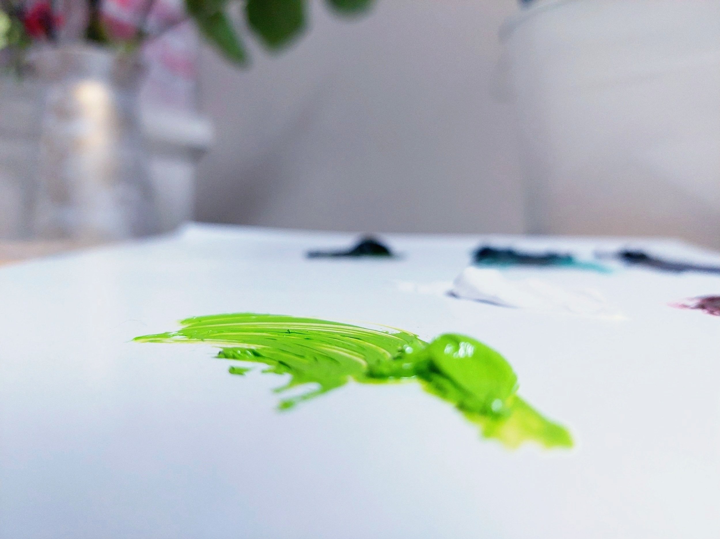
Oh I wish you could’ve heard me when I placed my first stroke of this Bright Yellow Green on a banana leaf. The outburst went something like “Aaaaaaa! Sometimes this happens when I make a mistake, but sometimes this happens when I’m on the right track. Nevertheless, it warrants a pause. I need to stop and notice why I had that reaction. In this case, I remember feeling moved by the extreme contrast of light and dark that appeared in that single stroke. I decided to stop what I was doing, so that feeling could remain on the canvas. If I had continued to blend the light color over more of the leaf, I may have lost the effect. For the light to look like it was blasting in from behind, a sharp line was the best choice. So I repeated this on other leaves in the path of the sun.

We tend to think a small amount of something doesn’t have as much impact as a large amount, but is that really true? When it comes to light, small bits have a lot of power. Like these sunrays and highlights. They have a magical quality about them that carry a lot of weight. Maybe it’s because they’re in the midst of darkness, but help us imagine a larger source of light nearby. When the imagination takes over, maybe things are magnified? Ripples in water and blades of grass are wonderful little catchers of light—helpful tools when tickling the imagination. Try using them in your art. And don’t forget to notice them in the real world too!
