Retro Clock Painting
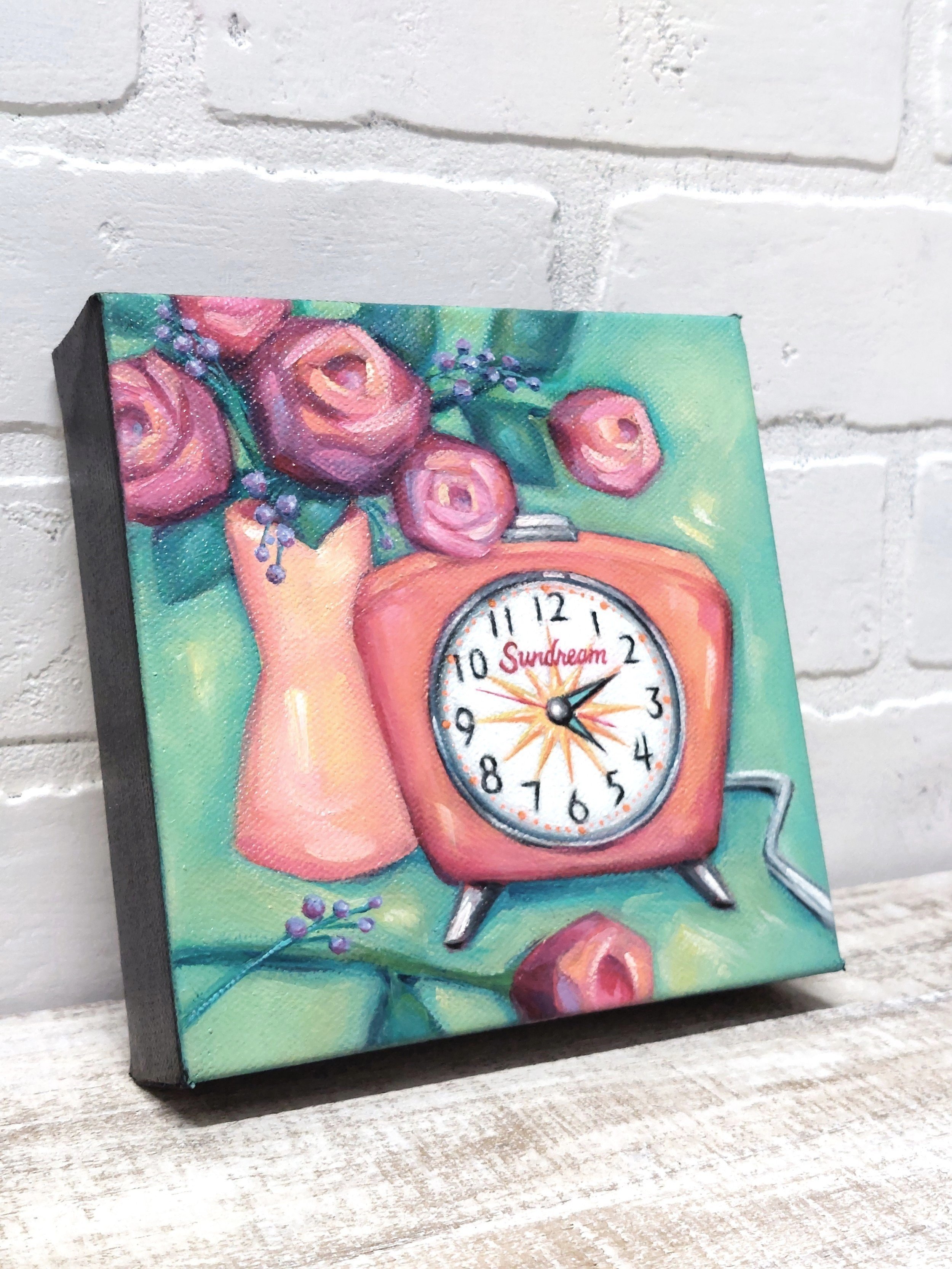
Anyone here remember winding a clock? The kind where a snooze button is an actual button—not a spot on a screen. You can feel the hard edges, hear the grind and click. These mechanical details aren’t so common these days, but I remember them. And these bits of nostalgia came rushing in with a recent mini painting I call Sundream.
A few years ago, a customer purchased two small pieces of mine. One was an old typewriter, the other an old camera. When she contacted me recently, she was wanting a third. Something larger to sit with the others on the shelf. Something similarly retro and whimsical. Needless to say, a smile came to my face. Retro and whimsy are my thing! She had these great ideas of what to paint, each one beckoning my brush, but surprisingly gave me “artist’s choice”. This freaked me out at first. What if I chose wrong? But I relaxed and settled into the challenge. Because really, how lucky could I be?


One of her ideas was a ‘fun Fifties desk clock’, and ultimately what I chose. So, to begin my process, I asked myself, “What do I think of when I think of a fifties desk clock?” The first thing that came to mind was The Jetson’s. Yes, that fabulous cartoon enigma that’s simultaneously retro and futuristic, simultaneously nostalgic and inspiring. This clock should be something like that, I thought. Hours later, when no trace of my thoughts were still in the air, I asked my husband, “What do you think of, when you think of a fifties desk clock?” And with his own deep thought, he said, “A spaceship that has just landed”. Cool. We were on the same page. It must be those spacy shapes! The kind that are geometric but also curvy, mathematical but also organic. Identifying this was one thing, but getting it on canvas was another. So I started with what I knew.

For colors, I knew the background would be green, to blend with the other two paintings. And for the ‘fun’ in ‘fun fifties desk clock”, maybe orange? It’s really the most fun color out there, except for pink, but pink was for the roses, so I had to choose orange. Permanent Orange #222 to be specific, by Michael Harding. And Lord! The light lives in this one, so if you use it, be prepared to tone it down. Lower… no, lower… there ya go. Yellow seemed the best choice for the vase because I wanted the objects to seem as one. This way, the warm colors could pop off the cool background. My composition was pretty clear from the start—clock and flowers cuddled together—but the details evolved over time. You can see the progression below.
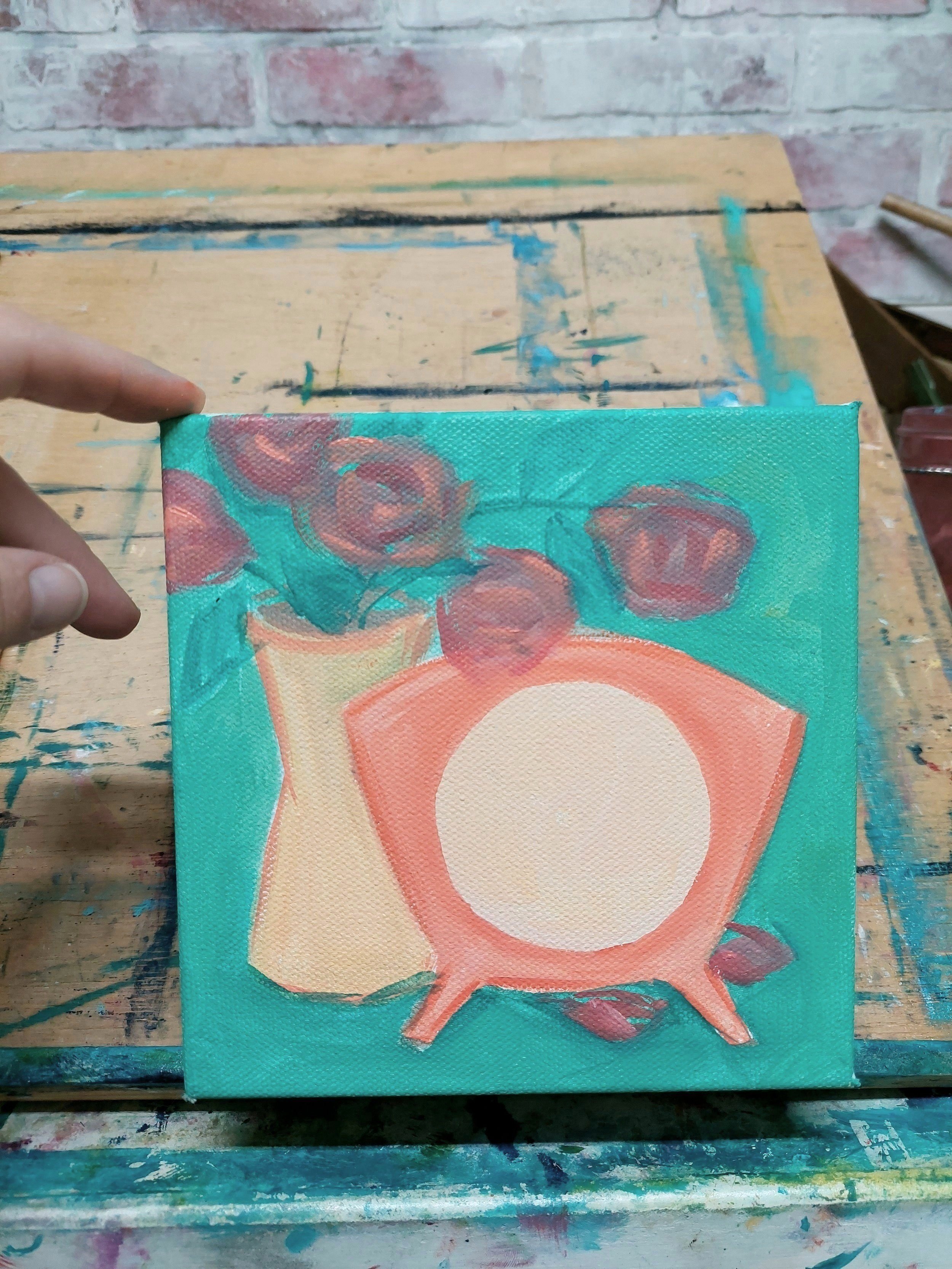
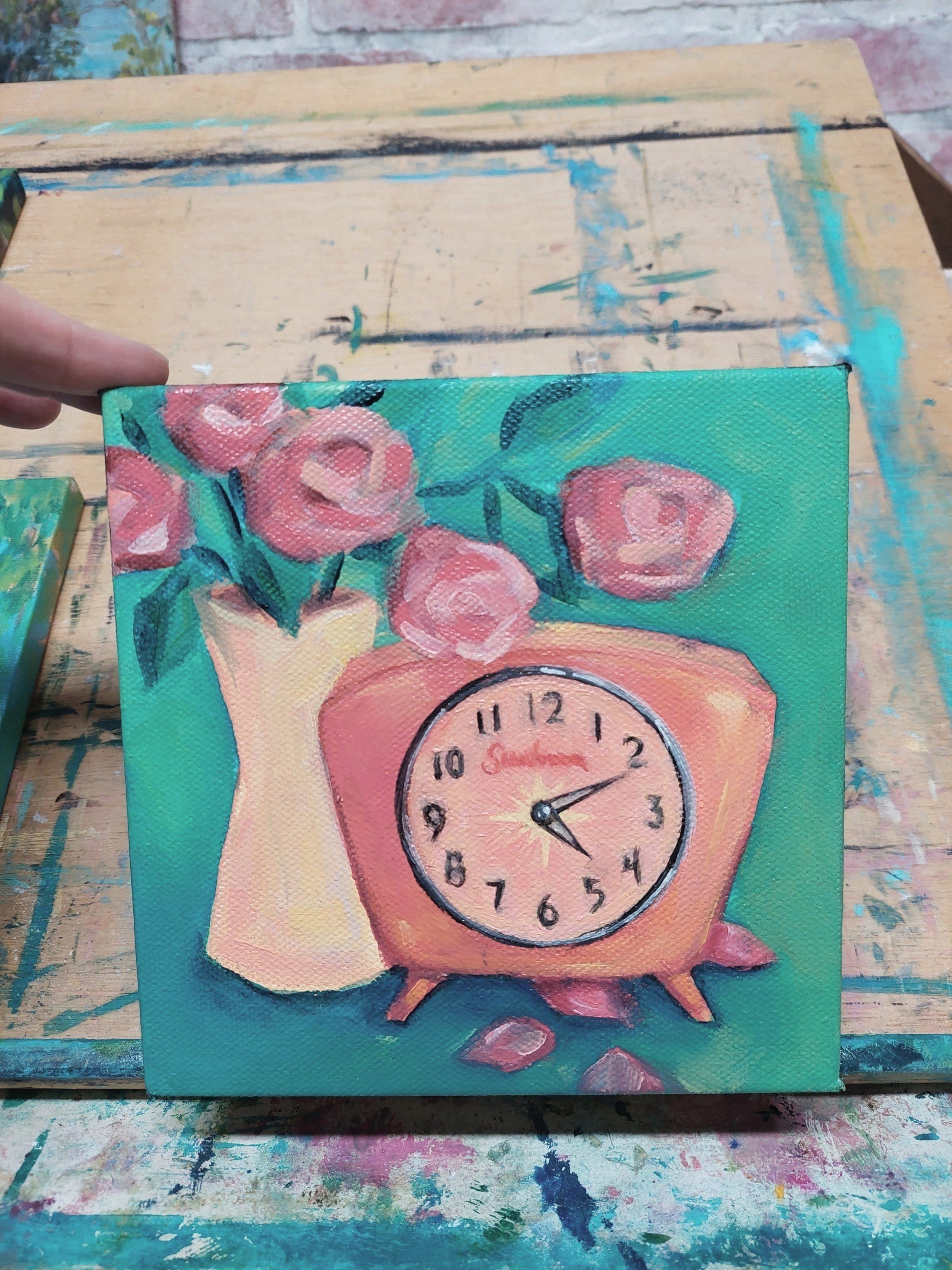
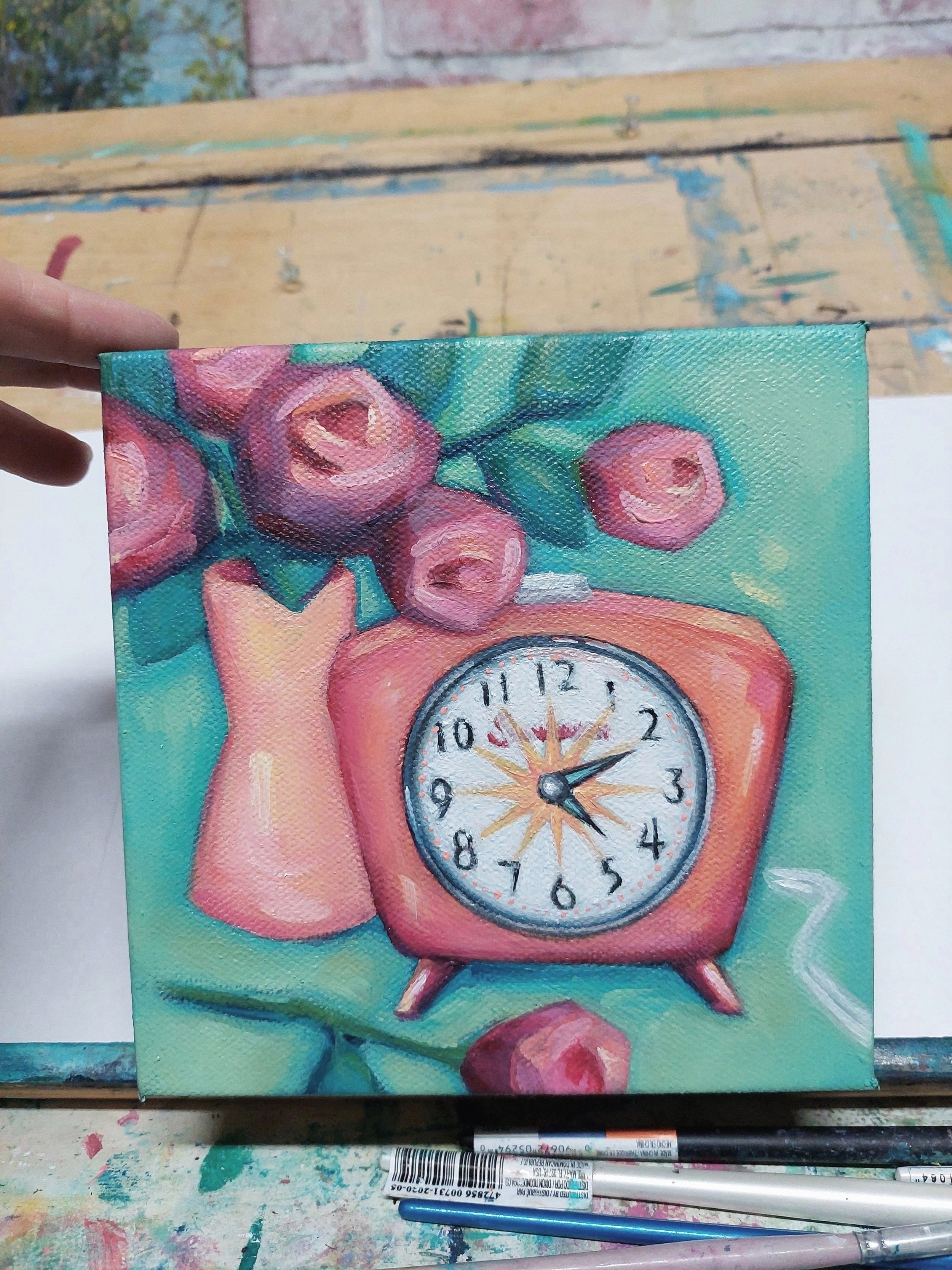
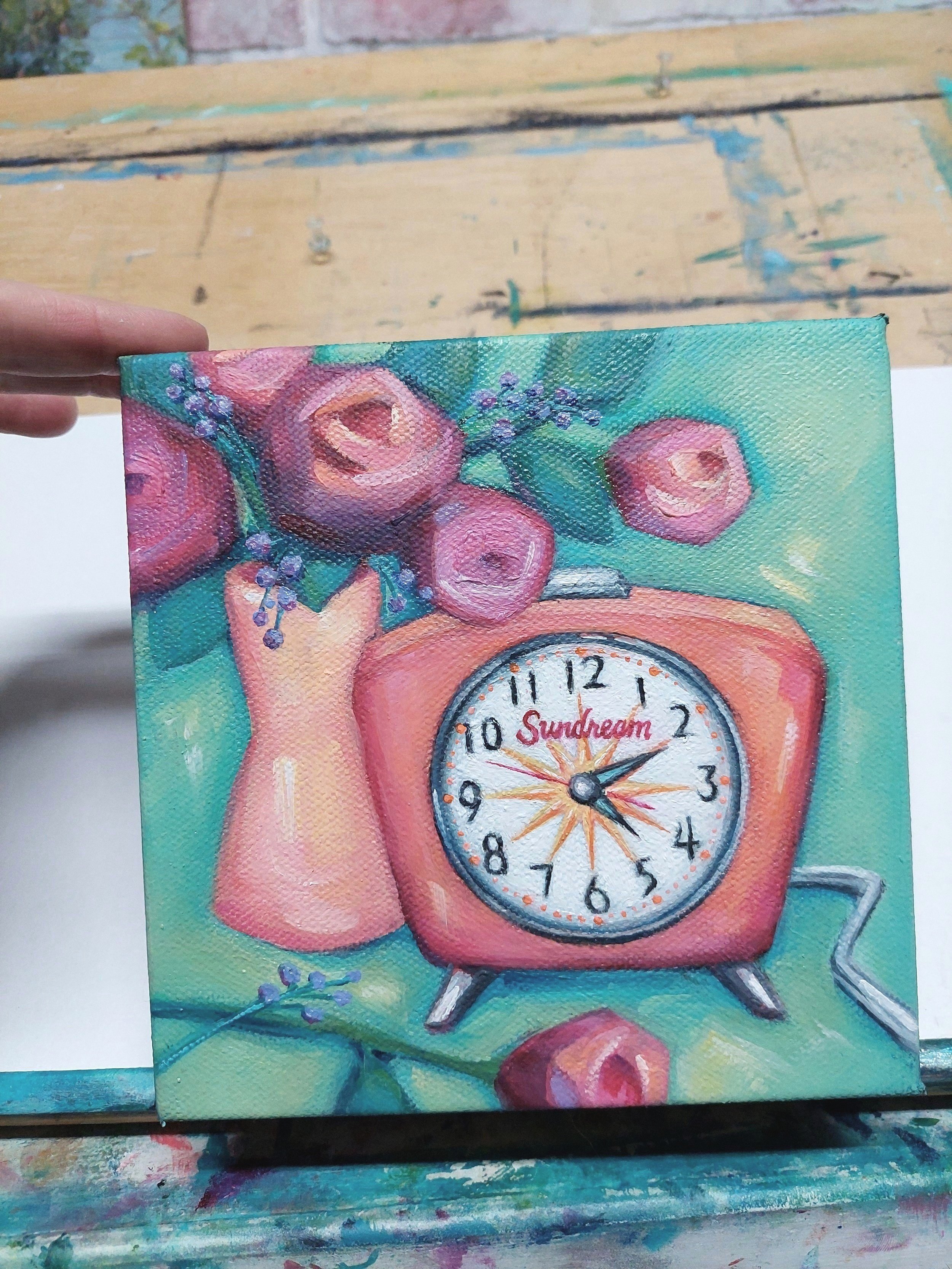
The outer shape was pointy at first, a little too extreme. It had that Jetson’s feel, but my heart tugged for a little more realism. So, I rounded the edges, added a glimpse of the top, and it started to have dimension. I still wanted sharp points though. They speak to the 50’s Era in some way. My mind kept seeing the old wall clock in my great grandmother’s house. One of those large, brass, super pointy golden suns. This style was 1950’s-ish right? Mid-century modern at least. Maybe I can use this shape somewhere else? The center? Yes! And then it became symbolic. A symbol of the light within.
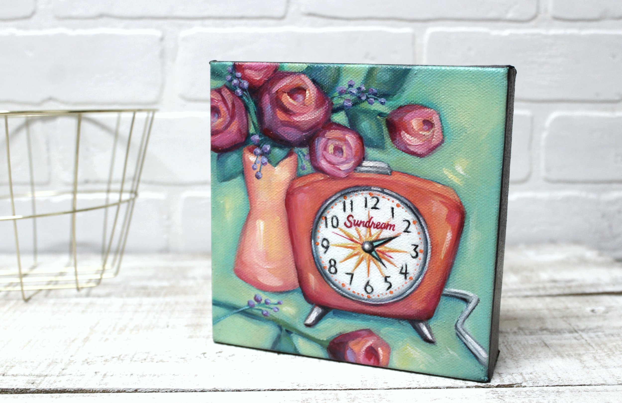
It felt appropriate, on this rainy day in May, when the sky was all grey. And it worked perfect with my pseudo brand name—Sundream. This is a play on words with the Sunbeam brand that was popular in those days. Similarly, in the customer’s other paintings, I used ‘Royalties’ for a Royal typewriter and ‘Nice Day’ for a Nikkormat camera. I liked keeping with this theme. Anything for a giggle.
Other parts were tweaked too. Petals replaced by a full rose for greater weight at the bottom. Instant gravity! The color of the face changed three times. First, tangerine—overkill. Then mint green, for a glow-in-the-dark feel. Nope, too eerie. Finally, white (which I thought would be too bright) was the best choice to keep this area in focus. Then I dashed in streaks of light here and there, because I had to let in the sun!
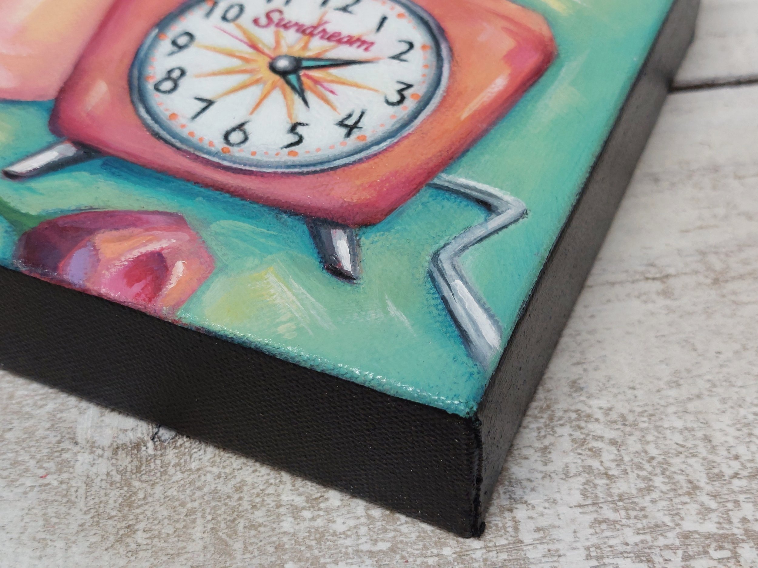
And the cord? Well, the cord makes it doesn’t it? This was the era that pushed sales of electric gizmos through the roof. The time when everyday objects became supercharged! It’s funny how nowadays, we see cords as unsightly, something to hide. But in those days, I bet it was a source of pride.


And speaking of supercharged, we come to purple. A color I never anticipated adding. But the flowers needed something extra. Tiny buds or berries? I didn’t want to use yellow or orange, for fear of competing with the big shapes. And white would’ve shown up too much. So, I tried a few blobs of violet, the bluer kind, like periwinkle, and suddenly—blink blink—something happened. A little charge of electricity. It was subtle, but definitely created a spark. Guess it’s just what the orange and yellow needed. Balance.
The color wheel strikes again! Using opposites on the color wheel is something I know to do for balance, but I rarely set out to do. A lot of times, I just play and get surprised. Seeing the theory in action though is always cool. Just try it! It’s a great example of the magic of harmony. Something we could all use more of these days.


Anyway, this little painting was tons of fun to make! I hope you enjoyed seeing a little of the process. It’s sitting on its new shelf now, adding color to someone’s day. And I’m off to check Youtube for The Jetson’s. Because, why not?
